Core
By Eastman Performance Films
Eastman’s flagship digital product, Core is being built to provide auto-shops with an easy to use and customizable experience for installing paint protection film (PPF). I was brought on as Eastman’s first external UX hire, working with stakeholders, dealers, pattern designers, and a team of developers in order to help create designs for the full suite of Core software, including the desktop app, mobile app, and dealer portal.
Overview
Process:
Agile Methodology
Competitive analysis and design research
Heuristic Evaluation
User research
Stakeholder and user interviews
Surveys
User analytics
Contextual inquiry
Journey Mapping
Site mapping
Sketching
Wireframing
Lo-fi prototype
User testing
Iterating
Hi-fi prototype
Team:
Stakeholders:
Kate Williams
Jacob Isbell
UX:
Jake Heberlie
Ryan Capogreco
Andie Hemmersmeier
Tools:
Pen & paper
Sketch
InVision
Miro
DevOps
Abstract
Microsoft Teams
Research
As I was brought onto the project after MVP had been built out for both the mobile and desktop apps, I dove into the initial research, poring over user interviews and testing, digging into the previous software, and surveying market alternatives. Along with giving me a better understanding of the software, it allowed me insight into the auto industry as a whole, something that I had zero experience with previously.
Accessibility/Usability Testing: During all this, one thing I quickly noticed was that the potential users tended to be overwhelmingly male. This presented an issue since the brand colors were red and green, the main colors associated with colorblindness. To ensure accessibility, I ran a usability audit, checking that text, icons, and buttons had high enough contrast, while examining pages through different types of color-blindness and visual impairment plug-ins in Sketch.
Another issue we kept running into was with the prevalence of sliders throughout the apps, creating frustration and usability issues among users, especially when they had to pick a specific year on a hundred year range.
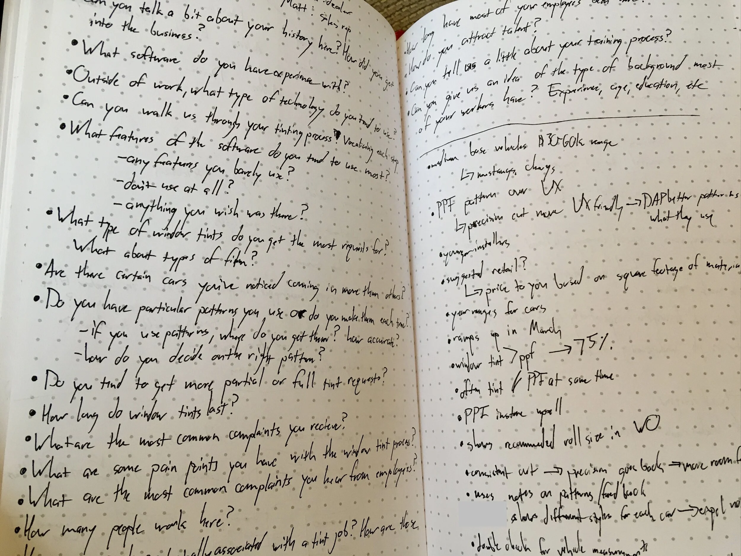
Site Visits: Along with the above research, I was also able to conduct several site visits where I was able to get a better understanding of the flow within the shops and witness firsthand installers using our competition’s software, along with interacting with our software for the first time. During these visits we received immediate feedback, learning features that we had missed, usability issues that we had become blind to because of how close we were to the software, and what parts they were particularly impressed by.
Journey Mapping: Realizing a need to better improve our management of the internal systems, we conducted a journey mapping session with some of our internal users and pattern managers. Here we walked through their different responsibilities, how they accomplished those, who they interacted with to accomplish them, and what opportunities there were available moving forward.
Personas: A major part of our research and empathy building was the fleshing out of personas, creating 4 user personas, ranging from the owners of large 4S shops that would consistently see the same vehicles, to installers at smaller PPF shops, who would deal with a wider range of vehicles. When I stepped onto the project, personas were already outlined, but I continued to refine and flesh them out as we learned more about our users and their particular needs and flows.
Re-work
After going through the research and continuing to talk to users, we realized that there were 3 main areas of concern:
Vehicle and parts selection process. While aesthetically pleasing, it quickly became apparent that the way we broke up the vehicle selection by having year, make, model, and trim all on separate pages, was confusing to users and led to more clicks and time spent on each page, especially if they realized they had made a mistake anywhere in the process. To solve this we took away the separate pages, having the year, make, model, trim selection all on one page, reducing clicks and making the flow more intuitive.
Floating tool bar. For this, we created a series of different prototypes that we tested with users, narrowing it down as we went until eventually landing on one that attached the toolbar to the top of the page, more in alignment with typical design and editing software.
Inability to save work done. While less of a concern at smaller shops, some of the larger or brand specific shops would see the same vehicles multiple times a week. Thus, if there was an issue with a pattern and it had to be edited, installers would be forced to do the same edits each time they saw that vehicle, instead of simply having it done one time. This ended up being surprisingly complex, as there were multiple ways to access vehicle creation and work orders. However, after diagraming the different flows, we eventually landed on saving the entire cutboard as MVP. This flow would show the saved name, a preview of the cutboard, the cutboard dimensions, and all parts on the board.
The Dealer Portal
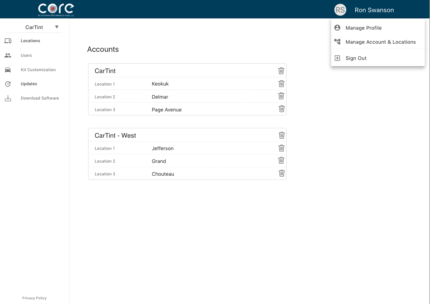
As we conducted research and continued building out the desktop app, we realized there was an opportunity to better serve the full spectrum of auto-shop workers from owners to installers, leading us to create a dealer portal that would allow owners/managers to better manage the different aspects of their business in relation to Core; as well as letting all users see regular updates to Core and manage their individual accounts, away from the desktop app which would be shared by all users.


