Dental Lifeline Network
A nationwide non-profit that has been in existence for over 40 years, Dental Lifeline Network (DLN) provides comprehensive dental services to the elderly, disabled, veterans, and others in need. However, their website needed some work, as their application process consistently saw a high drop-off rate, and the design proved unintuitive, especially for the demographics they serve. As such, my team was brought on by the organization’s Marketing Coordinator in order to improve both the volunteer and patient application processes, along with the overall layout of the site.
Overview
Process:
Competitive analysis and design research
Heuristic Evaluation
User research
Stakeholder and user interviews
Contextual inquiry
Card sorting analysis
Site mapping
Sketching
Wireframing,
Lo-fi prototype
User testing
Iterating
Hi-fi prototype
Team
Bri Shaffer
Inea Padilla
Role:
Needing some direction, I took over the roles of scrum master and lead researcher, along with participating in the project’s ideation and prototyping.
Tools:
Pen & paper
Sketch
Craft
InVision
Capian
Heuristic Evaluation & “Competitive” Analysis
We started off by delving into Dental Lifeline Network, examining its history and mission, before beginning on a heuristic evaluation of the site, where we quickly found an array of problems, ranging from usage of unclear company language, to buttons that were illegible to much of DLN’s clientele due to age and vision problems. Afterwards, we conducted a “competitive” analysis of other non-profits, both dental and more general, in order to see how DLN is able to differentiate itself, while also trying to find best practices as far as naming conventions, layout, etc.
User Research
Experiencing difficulty because of the sensitive nature of the patient experience, we started off by reading reviews of DLN online, consistently seeing how excited patients were for the procedure, but also that they experienced frustration with the unclear requirements, long waits, and overall application process. From there we examined the Google analytics for the DLN site, reinforcing what we already knew about the difficulty of the process, as evidenced through high drop-off rates with each consecutive page. Then, while we were sadly unable to reach any patients, we were able to interview various dental practitioners who gave us insight into the problems faced by dental offices in general, along with issues that had arisen while working with Dental Lifeline, such as unknown complications with patients that ended up requiring much more extensive work than advertised originally.
Personas
Gladys: The Patient
Goals
Be able to enjoy eating without pain
Find the cheapest and fastest way to receive treatment
Frustrations
Struggles with new technology
Doesn’t have dental insurance
Chewing has become painful
Afraid of going to the dentist
Claire: The Mediator
Goals
Manage her time more effectively
Find a better money collection system
Help as many people as possible
Frustrations
Client intake
Application processing
Collecting Medicaid
Teddy: The Dentist
Goals
Give back to the community
Watch his legacy continue to grow
Spending more time outside of the office
Frustrations
Not knowing what his non-profit patients are dealing with
Lack of time
Too many patients
Ideating Solutions
Noticing in the analytics that around 40% of users access DLN on their phones, along with generally being best practice, we started off with mobile designing, trying to make the site more accessible on phones, while also helping to make us realize exactly what features were most important to include in the process.
Prototypes
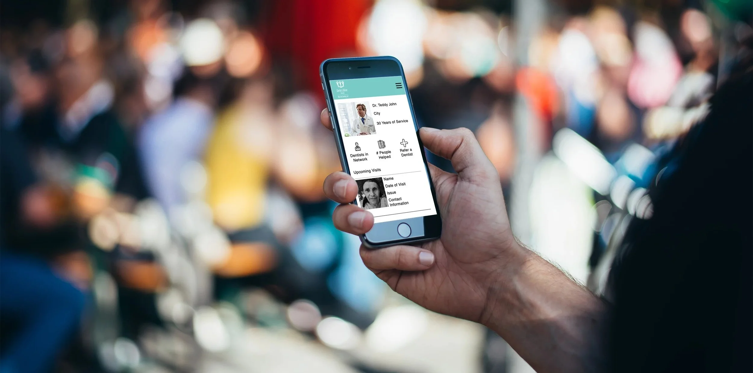
Realizing the need to simplify the site right from the start, we created a more intuitive header and footer with clearer directions on where to go, along with redoing the home and landing pages for patient and volunteer signups. In addition, we added a profile component that would allow dentists to see what patients they had coming up, and what cases they had treated through DLN in the past. Less visibly, I edited the introduction to the general application to highlight certain requirements, take away some unprofessional language, and incorporate a more consistent corporate voice.


